Week 1: Wheel of Questions

This week’s project comes from my half-bakery. It’s an idea I’ve already tried to build once, with results that were, well, less than spectacular.

Years ago, when I was working at SpinCar (now Impel), we had a tradition during our team meetings. My colleague CeeCee (Cecilia Hall) would fire up Wheel of Names, give it a spin, and whoever it landed on would have to answer a question.

We also used it during company all-hands meetings to randomly select employees for prizes. It was a simple way to add a little suspense and fun to an otherwise ordinary meeting.

But CeeCee had a frustration. The wheel was designed for names, not questions. What if, instead of randomly selecting a person to answer a question, we could spin a wheel that selected the question itself?

Naturally, I thought I could build something better.

And naturally, it wasn’t quite that simple.

My first attempt

I built a website from scratch using PHP, MySQL, and a third-party JavaScript wheel library called Winwheel.js.

Technically, it worked. Sort of.

But I could never quite get the usability right, and let’s be clear about something: I AM NOT A GRAPHIC DESIGNER.

I can write code, but I don’t do it often enough to be particularly good at it anymore. And trying to understand someone else’s code, especially when you’re working with a library that doesn’t quite do what you want, can be an exercise in frustration.

The result was functional, but utterly meh.
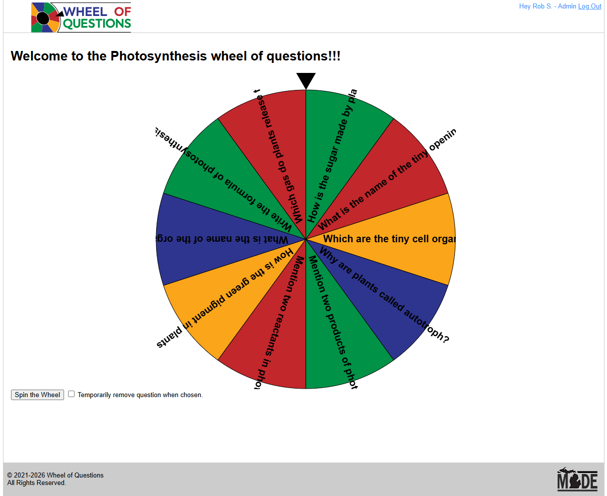
My original attempt. It worked, but nobody was going to mistake me for a graphic designer.

I left the site running anyway.

And something interesting happened. People actually used it.

Teachers, particularly foreign language teachers, created wheels filled with words and phrases for their students to translate. People made wheels for games, conversations, and all sorts of other activities. I even discovered a REALLY weird fetish-themed meet-and-greet wheel. 😅

Apparently, getting people to talk is a pretty universal problem.

Even more surprising, some people came back and used it again. This little project that I considered something of a failure had managed to find an audience.

Unfortunately, the person who originally inspired it wasn’t among them.

CeeCee actually visited the site and created an account, but she couldn’t simply paste in her list of names, and the whole experience was a bit clunky and wa missing features. She gave it a try and never looked back.
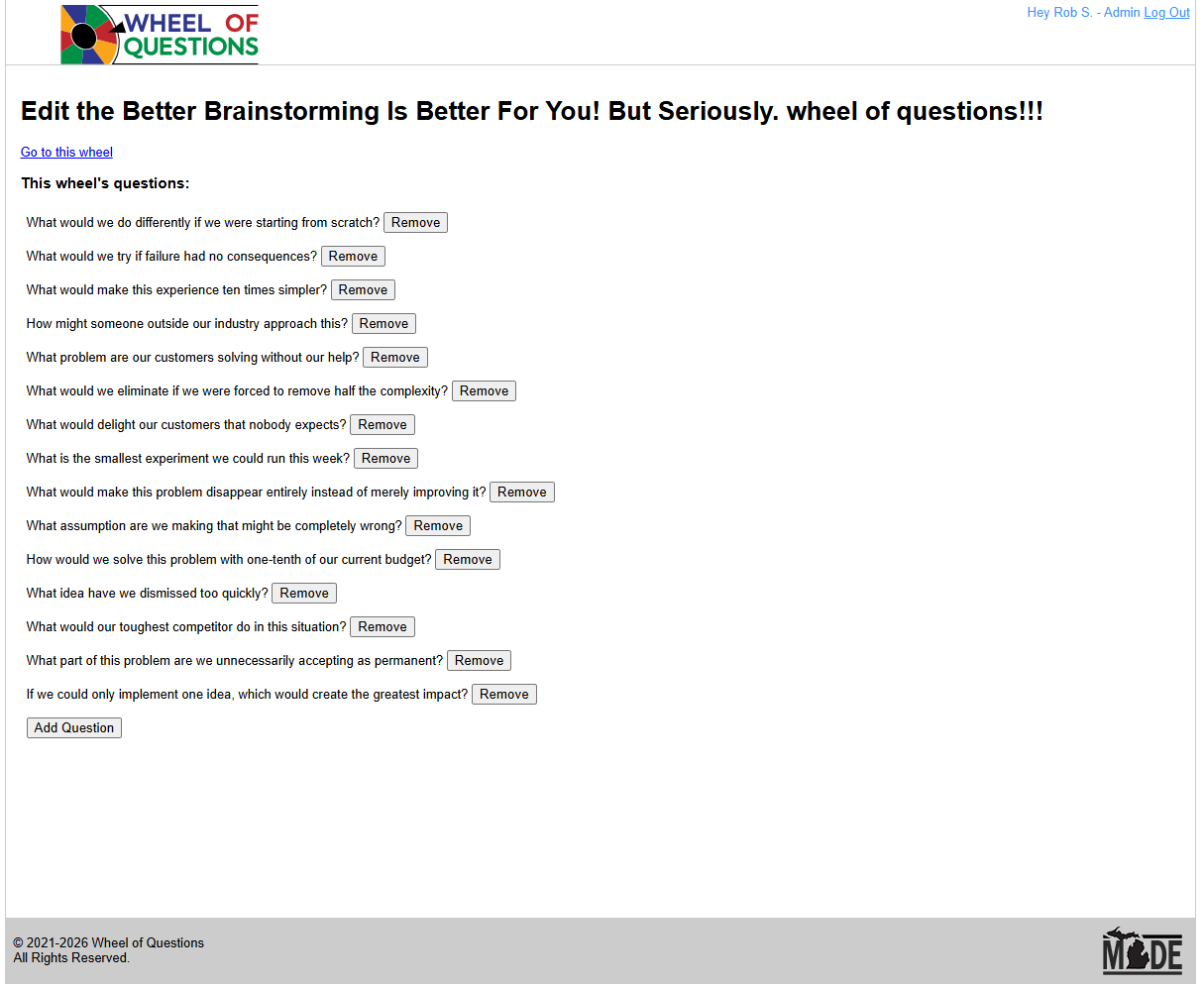
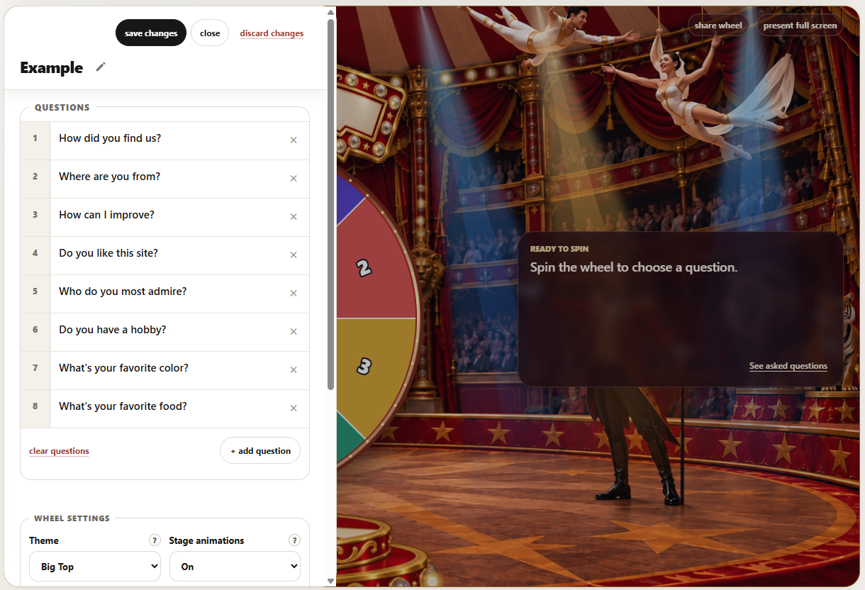
Adding questions one at a time. Apparently, pasting a list was too much to ask.

I had built something that technically solved a problem, but wasn’t good enough for the person who had the problem in the first place.

There’s probably a product management lesson in there somewhere.

Time for another spin.

I want to create something that looks great, is incredibly easy to use, and makes the simple act of randomly selecting a question feel like an event.

Think about it. For those few seconds when a wheel is spinning on a big screen, everyone in the room is watching it. The wheel has the audience’s undivided attention.

That moment deserves something more engaging than a spinning pie chart.

I want the wheel to be the star of the show.

People should be able to jump in and use a ready-made wheel, clone one and make it their own, or create something entirely new. Teachers should be able to put together an activity without fighting the interface. Someone running a meeting should be able to get everyone participating in a matter of seconds.

And yes, if someone wants to create another bizarre meet-and-greet wheel, who am I to judge?

This time, I’d also like to get away from the shared wheel library that constrained my original attempt. I’d rather have the flexibility to make the experience look and behave the way I imagine it.

Of course, imagining something and getting it to work are two very different things.

What can I build in a week?

I’m going to try to build and ship a completely new Wheel of Questions by Saturday.

Not just a prototype or a demonstration of what might eventually be possible, but an actual website people can use.

That’s a pretty ambitious goal, especially since I intend to do this through vibe coding rather than writing any of the code myself.

Over the last few years, my experience with that approach has been mixed. AI can be remarkably good at getting something working quickly. But the last 10% of a project, the little details, interactions, spacing, and visual polish that make something feel finished, can be maddeningly difficult.

It’s a bit like painting a room. The first coat goes on quickly. Then you spend the rest of the day touching up corners and wondering how you got paint on the ceiling.

My prediction? By Saturday, I’ll have a functioning site that people can actually use. Something that’s substantially better than my original attempt, both visually and functionally.

And perhaps the most important test of all?

I want to build something good enough that CeeCee would actually use it instead of Wheel of Names.

Let’s see how this goes.

Wk 1 – Update 1

It spins. That’s a start.

The first version of Wheel of Questions 2.0 is working. I have something to show the class, although I’m keeping my hand down for now.

My first goal was to replace the old site without losing what people had already created. Existing accounts, saved wheels, questions, and shared links needed to survive. Starting over is considerably less impressive when everyone else has to start over too.

That part worked. The site still runs on PHP and MySQL, using the existing database, but the experience around it has been rebuilt.

The biggest change is the wheel itself. We replaced Winwheel.js, the third-party library I used in my original attempt, with our own wheel renderer. That also removed the supporting animation library and other JavaScript dependencies. I can now ask for the wheel to behave differently without first negotiating with someone else’s code.

And we finally got the damn text to stop overflowing the wheel. Long questions don’t politely shorten themselves to fit inside a slice of someone else’s code. The new renderer shortens labels or uses numbers when things get crowded, then shows the full question when it’s selected. You can actually read it without watching half a sentence escape over the edge.

Digging through the original version also uncovered a bug where I was asking PHP to clean up the text of a database query instead of its results. Apparently, those are different things. PHP had strong feelings about it.

There’s another useful change: visitors can create questions and spin without making an account first. Registration can wait until they have something worth saving.

But getting the site working hasn’t solved the whole problem. Question management still needs attention. Entering, changing, and organizing a list should feel effortless, especially for a teacher getting ready for class or someone preparing a team meeting.

That was part of what sent CeeCee back to Wheel of Names the first time. A new wheel won’t fix a frustrating workflow.

So, the first pass got the site running and cut the cord to the old library. Next comes making it something people actually enjoy using.

The wheel spins. Now I need to make the rest of it worth the trip.

Wk 1 – Update 2

A spinning pie chart needs a better stage.

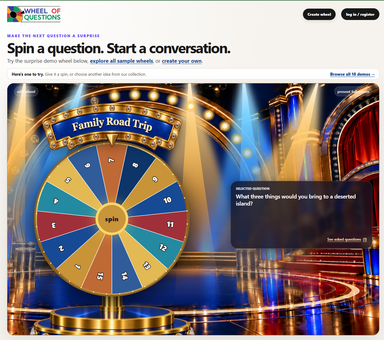
We added themes to Wheel of Questions. Users could change the colors, adjust the look and feel, and give their wheel a little personality.

It felt a bit like giving a kid a box of broken remnant crayons. Plenty of choices, but the materials weren’t doing anyone any favors.

Underneath it all, we still had a spinning pie chart with some pizzazz around the edges.

For those few seconds when the wheel is spinning, everyone in the room should be watching. I want a little anticipation. Something that feels like an event. Changing the colors wasn’t going to get us there.

We needed better design.

This is where AI’s image generation abilities became particularly useful. As previously established, I AM NOT A GRAPHIC DESIGNER. But I can describe what I’m imagining, react to what comes back, and keep asking for changes. I am persistent!

Our first attempt was a game show set: an over the top dramatic stage, lights, and room in the center for the wheel. No contestants. We already have an audience on the other side of the screen.

Originally, the base was part of the background image, and the title just floated above the wheel. It looked promising at the right screen size. But the base belonged to the background while the wheel moved and resized with the page. They weren’t necessarily going to stay attached. And the floating title needed somewhere to live.

So we separated the base from the background and created a marquee for the title. The background established the setting, while the base and marquee moved with the wheel as a single composition. The wheel finally had something to stand on, and its title had a proper home.

Keeping those pieces separate meant we could position them around the actual working wheel and put real, changeable text on the sign. A beautiful picture of a wheel would have been considerably easier. Unfortunately, it wouldn’t spin.

Getting those pieces to line up was painful. Move the marquee down. Move the wheel up. Show more of the base. Now the title doesn’t fit. Something would finally look right on my desktop, then I’d resize the window or go full screen and discover that the pieces had developed independent ambitions.

Responsive web design is a lovely concept until you’re trying to keep a wheel attached to its own pedestal, and have a marquee stay where you want it to.

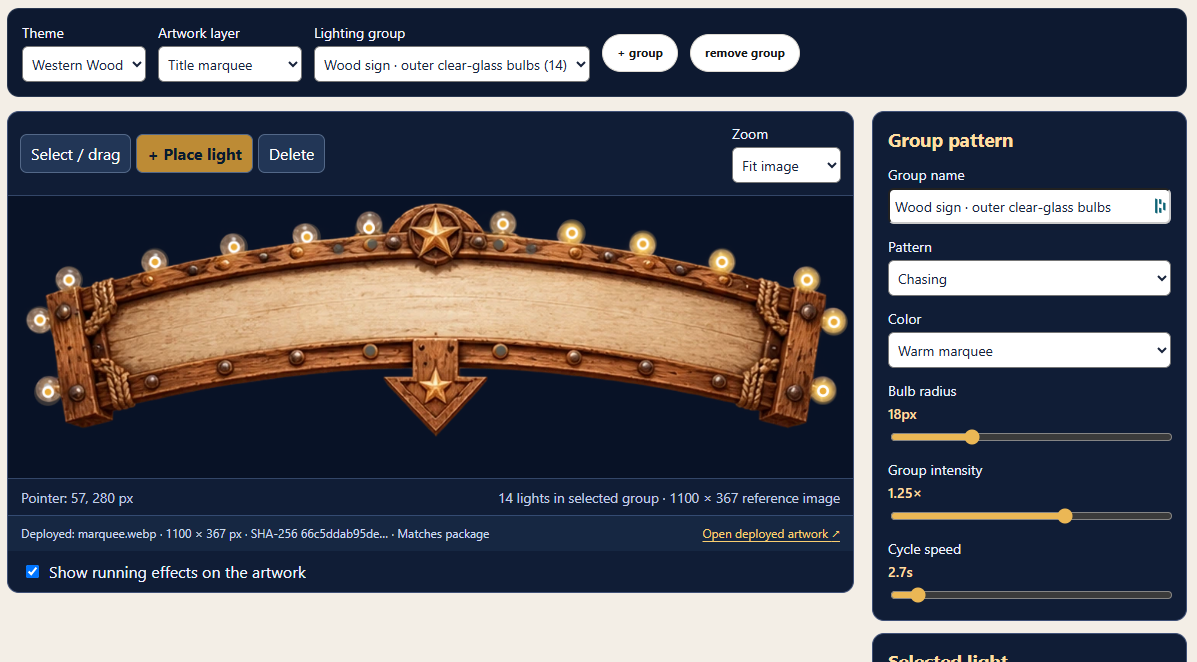
Eventually, we put those positioning and spacing settings into a theme editor. I could adjust the layout myself without another code change and upload every time something needed to move a few pixels.

The result was a BIG improvement. The wheel finally looked like it belonged somewhere.

But it still wasn’t a magical moment. The lights in the picture looked like lights. They didn’t actually do anything. Even “marching ants” would add life to a still screen.

I kept thinking about the way Ken Burns brings still photographs to life in his documentaries using the Ken Burns effect. A slow pan or zoom guides your attention and makes a motionless image feel like part of an unfolding story. That became an inspiration: we already had the artwork. Could we bring it to life through movement and light?

Our approach was to add animated lighting overlays. The picture stays still, but the light moves. It’s related to techniques like cinemagraphs, where selected movement makes an otherwise still scene feel alive. I’m not quite sure if this concept is novel enough to be named the “Streeter effect,” but we’re going to run with it until a lighting designer or patent attorney objects.

We added two kinds of lights to the editor. Bulbs could sit over the lights painted into the artwork, glow, pulse, or chase in groups. Moving spotlights could cast beams across the scene and sweep around the wheel.

I could place them directly over the images, change their position and intensity, and adjust their motion effects. Preview, tweak, try again. All without shipping more code.

That made a spectacular difference.

The stage suddenly had energy. The bulbs and sweeping beams gave the audience something to watch while the wheel spun. The artwork hadn’t changed, but the experience had. It finally felt like an event.

Wk 1 – Update 3

One good stage isn’t enough.

The game show theme was working. Now I had to figure out how to make another one without rebuilding the whole production.

I want people to be able to pick a fun wheel, add their questions, and use it. Most people have a class or a meeting to run. They do not have an afternoon set aside for stage design.

That pushed me to think about the parts we could reuse: the background, base, marquee, wheel placement, and lighting. The next theme should need new artwork and some adjustments in the editor, not another pile of special-case code. I’m trying to make future themes easier to build, and maybe future projects too.

Then there was the marquee. A short title looked stranded in the middle. A long one tried to leave the sign entirely. We made the text follow the curve, measured how much room the actual letters needed, and let longer titles split across two lines. Fonts, spacing, and screen size all had a vote. I spent more time negotiating with this sign than I expected.

The less glamorous work mattered just as much. Adding and editing questions needed to be quick, and the wheel needed to behave sensibly as questions were selected.

I also put the build version in the footer. We’re packaging each release and uploading it manually for now; we haven’t connected the project to source control yet. Seeing the version on the site gives me a quick answer to a very practical question: Did I upload the build I think I uploaded?

It’s a lot of attention for details people may never notice. That’s usually when the details are doing their job.

While I am amazed at how much I could accomplish so far, the PM in me wants more… I don’t have time for more right now. I have plans. Things to do this weekend. At least there isn’t a Michigan football game tomorrow!

Wk1 – Show and Tell!

Wheel of Questions!

I’m energized, but I’m also a little tired. It feels like the last morning of a Startup Weekend: the demo is coming, I’m proud of what we made, and I can still see six (or sixteen) things I’d fix if someone gave me one more hour.

The old Wheel of Questions had a few real users. It also had a problem I couldn’t ignore: CeeCee tried to add her questions, got frustrated, and went back to Wheel of Names. I wanted to give her a reason to try again.

So here it is, resurrected from the half bakery: Wheel of Questions 2.0. Pick an example and spin it. Then make your own. Paste in a list of questions and you’re ready to go, even without an account.

Of course, I had the dreaded installed base. I couldn’t bulldoze everyone’s wheels and claim eminent domain. Existing accounts, questions, and shared links had to keep working while I rebuilt the experience around them.

Once that was working, I wanted the spin to feel like an event. One stage became several, with artwork, a marquee, and lights that move around the wheel. I built a theme editor so I could position the pieces and tune the lighting myself. That’s how I ended up spending part of the week adjusting stage lighting for a spinning wheel.

I spent about 19 hours working with AI over the course of the week. The site is much closer to the thing I imagined, though my list of things to improve is still growing. For now, I want to see what happens when other people use it.

Give the wheel a spin, and please leave me a note in the suggestion box. Tell me what worked, what confused you, or what broke. I especially want to know how it feels to experience your first wheel.

Tomorrow is a new week, and a new project. Stay tuned!